Your Library, revamped
Focus
Accessible UX/UI
Tools
Figma, Protopie
Duration
4 months
Overview
Overview
Though Spotify is one of the biggest streaming services currently on the market, its current library system is not optimized for efficient organization.
With the visually impaired in mind, my redesign reorganizes the visual hierarchy to have clearer categories and straightforward wayfinding by using defined sections echoing the layout of the Homepage. This conceptual prototype aims to empower listeners by giving them a more distinct classification system over their content.
Though Spotify is one of the biggest streaming services currently on the market, its current library system is not optimized for efficient organization.
With the visually impaired in mind, my redesign reorganizes the visual hierarchy to have clearer categories and straightforward wayfinding by using defined sections echoing the layout of the Homepage. This conceptual prototype aims to empower listeners by giving them a more distinct classification system over their content.
For all intents and purposes, I do not own any rights to Spotify or the exisiting assets used in this case study. This academic project aimed to explore accessibility in user interface and experience design using existing platforms.
Organizes content types into their own sections for easy access on main page
Organizes content types into their own sections for easy access on main page

Subpages containing each saved content
Subpages containing each saved content


Corresponding icons on cover art
Corresponding icons on cover art

check out the working prototype!
check out the working prototype!

Insights
Insights
In using Spotify myself and talking with my peers, we found that the Library does the job, but not to the best of its ability. All saved content is lumped into one pile with little visual differentiation between content types. Users were often left feeling frustrated trying to navigate their content. If my peers with high visual acuity find it difficult to use, how do visually impaired users feel? This prompted the question:
In using Spotify myself and talking with my peers, we found that the Library does the job, but not to the best of its ability. All saved content is lumped into one pile with little visual differentiation between content types. Users were often left feeling frustrated trying to navigate their content. If my peers with high visual acuity find it difficult to use, how do visually impaired users feel? This prompted the question:
How might I redesign Spotify’s Your Library to optimize organization and access between different types of users’ saved content?
How might I redesign Spotify’s Your Library to optimize organization and access between different types of users’ saved content?
I dived into this problem statement using a research triangulation method that consisted of semi-structured interviews, a literature review, and a short comparative analysis of Apple Music’s library system.
I dived into this problem statement using a research triangulation method that consisted of semi-structured interviews, a literature review, and a short comparative analysis of Apple Music’s library system.
Interview key points
Lack of a definite categorization system makes it frustrating to navigate and dig through, often needing time and focus just to find content.
Users bypass the provided filter system, reporting that it’s easily overlooked when searching for saved content.
Overall dissatisfied with the way their content is compiled and managed all on one page with a poorly developed visual hierarchy system.
Literature review
Official user feedback studies reported library organization to be a central need, but didn’t want to spend time doing so to shift focus more on discovering and listening to music.

Comparative analysis
Distinct categories between content types on Apple Music are prominent and placed above Recently Added, making it the first feature that users see whenever they launch the app.


Interview key points
Lack of a definite categorization system makes it frustrating to navigate and dig through, often needing time and focus just to find content.
Users bypass the provided filter system, reporting that it’s easily overlooked when searching for saved content.
Overall dissatisfied with the way their content is compiled and managed all on one page with a poorly developed visual hierarchy system.
Literature review
Official user feedback studies reported library organization to be a central need, but didn’t want to spend time doing so to shift focus more on discovering and listening to music.
Comparative analysis
Distinct categories between content types on Apple Music are prominent and placed above Recently Added, making it the first feature that users see whenever they launch the app.
Interview key points
Lack of a definite categorization system makes it frustrating to navigate and dig through, often needing time and focus just to find content.
Users bypass the provided filter system, reporting that it’s easily overlooked when searching for saved content.
Overall dissatisfied with the way their content is compiled and managed all on one page with a poorly developed visual hierarchy system.
Literature review
Official user feedback studies reported library organization to be a central need, but didn’t want to spend time doing so to shift focus more on discovering and listening to music.
Comparative analysis
Distinct categories between content types on Apple Music are prominent and placed above Recently Added, making it the first feature that users see whenever they launch the app.
Interview key points
Lack of a definite categorization system makes it frustrating to navigate and dig through, often needing time and focus just to find content.
Users bypass the provided filter system, reporting that it’s easily overlooked when searching for saved content.
Overall dissatisfied with the way their content is compiled and managed all on one page with a poorly developed visual hierarchy system.
Literature review
Official user feedback studies reported library organization to be a central need, but didn’t want to spend time doing so to shift focus more on discovering and listening to music.
Comparative analysis
Distinct categories between content types on Apple Music are prominent and placed above Recently Added, making it the first feature that users see whenever they launch the app.
I concluded that Spotify’s library management system, though representative of each user’s individuality, is not optimized for efficient organization. The lack of clear categorization and a visual hierarchy of information has negatively affected overall user experience. Users are left frustrated over way-finding through their saved content and dissatisfied with how it’s organized and arranged.
I concluded that Spotify’s library management system, though representative of each user’s individuality, is not optimized for efficient organization. The lack of clear categorization and a visual hierarchy of information has negatively affected overall user experience. Users are left frustrated over way-finding through their saved content and dissatisfied with how it’s organized and arranged.
Interview key points
Lack of a definite categorization system makes it frustrating to navigate and dig through, often needing time and focus just to find content.
Users bypass the provided filter system, reporting that it’s easily overlooked when searching for saved content.
Overall dissatisfied with the way their content is compiled and managed all on one page with a poorly developed visual hierarchy system.
Literature review
Official user feedback studies reported library organization to be a central need, but didn’t want to spend time doing so to shift focus more on discovering and listening to music.

Comparative analysis
Distinct categories between content types on Apple Music are prominent and placed above Recently Added, making it the first feature that users see whenever they launch the app.
Interview key points
Lack of a definite categorization system makes it frustrating to navigate and dig through, often needing time and focus just to find content.
Users bypass the provided filter system, reporting that it’s easily overlooked when searching for saved content.
Overall dissatisfied with the way their content is compiled and managed all on one page with a poorly developed visual hierarchy system.
Literature review
Official user feedback studies reported library organization to be a central need, but didn’t want to spend time doing so to shift focus more on discovering and listening to music.
Comparative analysis
Distinct categories between content types on Apple Music are prominent and placed above Recently Added, making it the first feature that users see whenever they launch the app.
Interview key points
Lack of a definite categorization system makes it frustrating to navigate and dig through, often needing time and focus just to find content.
Users bypass the provided filter system, reporting that it’s easily overlooked when searching for saved content.
Overall dissatisfied with the way their content is compiled and managed all on one page with a poorly developed visual hierarchy system.
Literature review
Official user feedback studies reported library organization to be a central need, but didn’t want to spend time doing so to shift focus more on discovering and listening to music.
Comparative analysis
Distinct categories between content types on Apple Music are prominent and placed above Recently Added, making it the first feature that users see whenever they launch the app.
Interview key points
Lack of a definite categorization system makes it frustrating to navigate and dig through, often needing time and focus just to find content.
Users bypass the provided filter system, reporting that it’s easily overlooked when searching for saved content.
Overall dissatisfied with the way their content is compiled and managed all on one page with a poorly developed visual hierarchy system.
Literature review
Official user feedback studies reported library organization to be a central need, but didn’t want to spend time doing so to shift focus more on discovering and listening to music.
Comparative analysis
Distinct categories between content types on Apple Music are prominent and placed above Recently Added, making it the first feature that users see whenever they launch the app.
Defining
Defining
Based on my insights, I developed a persona spectrum that represented different levels of visual impairment to better understand my end users.
Based on my insights, I developed a persona spectrum that represented different levels of visual impairment to better understand my end users.

Jake Layla
he/him, 21 years old
Physics undergrad student
Diagnosed with ADHD
Jake is very passionate about his studies in physics, to the point where he loves to talk about it outside of academics. As someone with ADHD, he often loses focus easily and tends to go on tangents talking about other, sometimes related, topics. His struggles with attention often bleed into other part of his life, such as staying on track with simple everyday tasks.
Frustrations
Can’t keep track of content all jumbled together
Feels overwhelmed by the arrangement of content
Goals
Find and recall where specific content is in Your Library
Have more control over how to organize content
Ideal features
Definite categories separating content types from one another
More options on how to customize the display
Steph Davis
she/her, 19 years old
Varsity rugby player
Concussion recovery
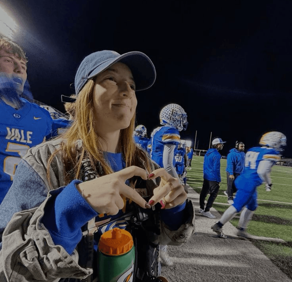
From high school into college, Steph loves being on the field. Playing rugby helps her let emotions out and destress between classes. After a recent game, she incurred a pretty rough concussion that’s been affecting her vision and attention retention. Listening to her hype up playlists on Spotify has been helping her stay positive while in recovery.
Frustrations
Needsextra effort to read the small content type labels
Often feels lost with way-finding through content
Goals
Easily differentiate between content types
Quickly and easily find her playlists in Your Library
Ideal features
Clearer content type identification
Better contrast between informative labels

Luna Johnson
they/them, 20 years old
Animation student
Commuter (driver)
Luna has been a hardcore music fan all their life and loves to listen to their favourite songs in every possible moment they can. While working on assignments, doing household chores, and especially during their long drives to classes. Their playlists help them set the mood for another day of classes and also make the drive more interesting.
Frustrations
Focus is redirected away from the road when finding playlists
Too much scrolling to find content in Your Library
Goals
Find the right playlists/albums efficiently and safely
Switch between content easily when preoccupied
Ideal features
More pins or have them take up more space
Different sizing options for easier access between content
Jake Layla
he/him, 21 years old
Physics undergrad student
Diagnosed with ADHD
Jake is very passionate about his studies in physics, to the point where he loves to talk about it outside of academics. As someone with ADHD, he often loses focus easily and tends to go on tangents talking about other, sometimes related, topics. His struggles with attention often bleed into other part of his life, such as staying on track with simple everyday tasks.
Frustrations
Can’t keep track of content all jumbled together
Feels overwhelmed by the arrangement of content
Goals
Find and recall where specific content is in Your Library
Have more control over how to organize content
Ideal features
Definite categories separating content types from one another
More options on how to customize the display
Steph Davis
she/her, 19 years old
Varsity rugby player
Concussion recovery
From high school into college, Steph loves being on the field. Playing rugby helps her let emotions out and destress between classes. After a recent game, she incurred a pretty rough concussion that’s been affecting her vision and attention retention. Listening to her hype up playlists on Spotify has been helping her stay positive while in recovery.
Frustrations
Needsextra effort to read the small content type labels
Often feels lost with way-finding through content
Goals
Easily differentiate between content types
Quickly and easily find her playlists in Your Library
Ideal features
Clearer content type identification
Better contrast between informative labels
Luna Johnson
they/them, 20 years old
Animation student
Commuter (driver)
Luna has been a hardcore music fan all their life and loves to listen to their favourite songs in every possible moment they can. While working on assignments, doing household chores, and especially during their long drives to classes. Their playlists help them set the mood for another day of classes and also make the drive more interesting.
Frustrations
Focus is redirected away from the road when finding playlists
Too much scrolling to find content in Your Library
Goals
Find the right playlists/albums efficiently and safely
Switch between content easily when preoccupied
Ideal features
More pins or have them take up more space
Different sizing options for easier access between content
Jake Layla
he/him, 21 years old
Physics undergrad student
Diagnosed with ADHD
Jake is very passionate about his studies in physics, to the point where he loves to talk about it outside of academics. As someone with ADHD, he often loses focus easily and tends to go on tangents talking about other, sometimes related, topics. His struggles with attention often bleed into other part of his life, such as staying on track with simple everyday tasks.
Frustrations
Can’t keep track of content all jumbled together
Feels overwhelmed by the arrangement of content
Goals
Find and recall where specific content is in Your Library
Have more control over how to organize content
Ideal features
Definite categories separating content types from one another
More options on how to customize the display
Steph Davis
she/her, 19 years old
Varsity rugby player
Concussion recovery
From high school into college, Steph loves being on the field. Playing rugby helps her let emotions out and destress between classes. After a recent game, she incurred a pretty rough concussion that’s been affecting her vision and attention retention. Listening to her hype up playlists on Spotify has been helping her stay positive while in recovery.
Frustrations
Needsextra effort to read the small content type labels
Often feels lost with way-finding through content
Goals
Easily differentiate between content types
Quickly and easily find her playlists in Your Library
Ideal features
Clearer content type identification
Better contrast between informative labels
Luna Johnson
they/them, 20 years old
Animation student
Commuter (driver)
Luna has been a hardcore music fan all their life and loves to listen to their favourite songs in every possible moment they can. While working on assignments, doing household chores, and especially during their long drives to classes. Their playlists help them set the mood for another day of classes and also make the drive more interesting.
Frustrations
Focus is redirected away from the road when finding playlists
Too much scrolling to find content in Your Library
Goals
Find the right playlists/albums efficiently and safely
Switch between content easily when preoccupied
Ideal features
More pins or have them take up more space
Different sizing options for easier access between content
Jake Layla
he/him, 21 years old
Physics undergrad student
Diagnosed with ADHD
Jake is very passionate about his studies in physics, to the point where he loves to talk about it outside of academics. As someone with ADHD, he often loses focus easily and tends to go on tangents talking about other, sometimes related, topics. His struggles with attention often bleed into other part of his life, such as staying on track with simple everyday tasks.
Frustrations
Can’t keep track of content all jumbled together
Feels overwhelmed by the arrangement of content
Goals
Find and recall where specific content is in Your Library
Have more control over how to organize content
Ideal features
Definite categories separating content types from one another
More options on how to customize the display
Steph Davis
she/her, 19 years old
Varsity rugby player
Concussion recovery
From high school into college, Steph loves being on the field. Playing rugby helps her let emotions out and destress between classes. After a recent game, she incurred a pretty rough concussion that’s been affecting her vision and attention retention. Listening to her hype up playlists on Spotify has been helping her stay positive while in recovery.
Frustrations
Needsextra effort to read the small content type labels
Often feels lost with way-finding through content
Goals
Easily differentiate between content types
Quickly and easily find her playlists in Your Library
Ideal features
Clearer content type identification
Better contrast between informative labels
Luna Johnson
they/them, 20 years old
Animation student
Commuter (driver)
Luna has been a hardcore music fan all their life and loves to listen to their favourite songs in every possible moment they can. While working on assignments, doing household chores, and especially during their long drives to classes. Their playlists help them set the mood for another day of classes and also make the drive more interesting.
Frustrations
Focus is redirected away from the road when finding playlists
Too much scrolling to find content in Your Library
Goals
Find the right playlists/albums efficiently and safely
Switch between content easily when preoccupied
Ideal features
More pins or have them take up more space
Different sizing options for easier access between content
To get to the heart of where their frustrations lie, I used empathy and user journey maps that cover their shared experiences as users with both permanent and temporary visual impairments.
To get to the heart of where their frustrations lie, I used empathy and user journey maps that cover their shared experiences as users with both permanent and temporary visual impairments.
Says
Mid at best
Does the job, but it could do better
I’d want more control over how to categorize my content
I forget about the filters a lot of the time
The experience doesn’t feel intuitive
Does
Scroll through to find specific content
Listen to music in background
Squint to read the content type label
Switch between grid and list view
Pin favourites/most listened to content
Thinks
I want to listen to a specific playlist before a task
Recalling when they last listened to a piece of content to find it
Why do I have to scroll so much...
Let me find my stuff quickly and easily
Feels
Frustrated over too much scrolling
Dissatisfied with content management
Stressed over accidentally tapping the wrong content when preoccupied
Confused over where content is located and the available features


Testing
Testing
My research showed that providing users with more distinct categorization that organizes their personal space would help make their experience more enjoyable and satisfying. To make it more visually distinct from one another, I reorganized the Library to have sections separating content types.
This led me to create a low-fidelity paper prototype that explores a new navigational system that gives control over organization back to users.
My research showed that providing users with more distinct categorization that organizes their personal space would help make their experience more enjoyable and satisfying. To make it more visually distinct from one another, I reorganized the Library to have sections separating content types.
This led me to create a low-fidelity paper prototype that explores a new navigational system that gives control over organization back to users.
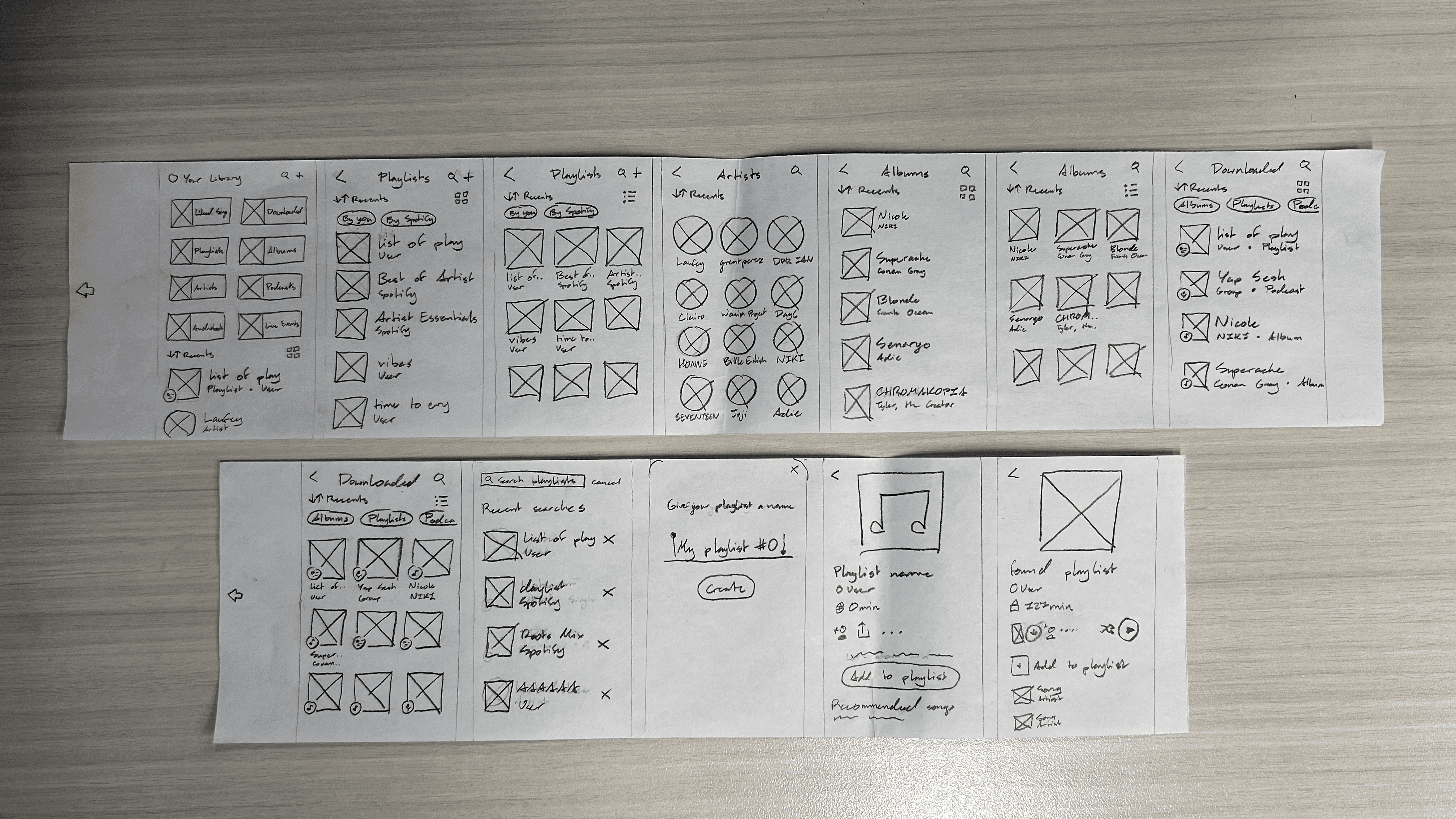

The layout of the interfaces remained relatively the same, so as not disrupt their mental models of the experience. I conducted a series of user tests with four participants using this prototype, which yielded these key takeaways.
The layout of the interfaces remained relatively the same, so as not disrupt their mental models of the experience. I conducted a series of user tests with four participants using this prototype, which yielded these key takeaways.
Recently Played on Home
Users commented on how much more connected and cohesive the visual language is with how the categories mirror those used in the Recently Played on Home.
More customization
Users want more control over which categories are shown in their libraries and let them choose what kind of content they want to see.
Overall positive reception
Proposed redesign was well-received during testing, with participants showing more preference for this system over the current filters.
Recently Played on Home
Users commented on how much more connected and cohesive the visual language is with how the categories mirror those used in the Recently Played on Home.
More customization
Users want more control over which categories are shown in their libraries and let them choose what kind of content they want to see.
Overall positive reception
Proposed redesign was well-received during testing, with participants showing more preference for this system over the current filters.
Wireframing
Wireframing
I applied their feedback towards polished assets by cleaning up the icons and buttons, namely the new ones I created for playlists, live events, and audiobooks.
I applied their feedback towards polished assets by cleaning up the icons and buttons, namely the new ones I created for playlists, live events, and audiobooks.
Liked Songs
Downloaded
Playlists
Albums
Podcasts
Artists
Live Events
Audiobooks
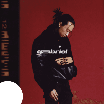
These icons were also applied to the grid and list views of the content to differentiate them in the main library section.
These icons were also applied to the grid and list views of the content to differentiate them in the main library section.

SEVENTEEN
GABRIEL
Album • keshi
daylist • romantic unrequited love ...
Playlist • Mad...
29
Jun
Stray Kids
Event • Rogers S...

Distractible
Podcast • Dis...

I’m Glad My Mom Died
Audiobook • Jen...

SEVENTEEN

GABRIEL
Album • keshi

daylist • romantic unrequited love aft...
Playlist • Made for bee ʕ•ᴥ•ʔ

29
Jun
Stray Kids
Event • Rogers Stadium, Toronto

Distractible
Album • Distractible

I’m Glad My Mom Died
Audiobook • Jennette McCurdy
These colours were also applied to headers for subpages that contained their respective content categories.
These colours were also applied to headers for subpages that contained their respective content categories.

Downloaded
9:41

Playlists
9:41

Albums
9:41

Artists
9:41
I reorganized these assets into the original Spotify layout for my final, high-fidelity wireframes in order to move into the next and final phase.
I reorganized these assets into the original Spotify layout for my final, high-fidelity wireframes in order to move into the next and final phase.
Prototyping
Prototyping
I transferred my wireframes into Protopie for the final interactive prototype that simulates the proposed solution. The following links are the Handoff files describe the actions developers would need to implement into the app.
I transferred my wireframes into Protopie for the final interactive prototype that simulates the proposed solution. The following links are the Handoff files describe the actions developers would need to implement into the app.

Takeaways
Design holistically with others
Accessible design affects more than just my immediate community, so keeping a wider, even global, audience in mind will help towards creating meaningful designs for all.
Seek out all angles of a challenge
To fully understand whether something presents as a challenge, seeking out different perspectives on it forms an enriching base that informs and guides the rest of the design process.
3.
Ask for help and feedback, always
Gaining feedback and receiving a fresh set of eyes throughout the design process helps avoid bias and find overlooked errors to always check in and make sure that the design is thoughtful.
Takeaways
Design holistically with others
Accessible design affects more than just my immediate community, so keeping a wider, even global, audience in mind will help towards creating meaningful designs for all.
Seek out all angles of a challenge
To fully understand whether something presents as a challenge, seeking out different perspectives on it forms an enriching base that informs and guides the rest of the design process.
3.
Ask for help and feedback, always
Gaining feedback and receiving a fresh set of eyes throughout the design process helps avoid bias and find overlooked errors to always check in and make sure that the design is thoughtful.
Your Library revamp
Focus
Accessible UX/UI
Tools
Figma, Protopie
Duration
4 months
Your Library revamp
Focus
Accessible UX/UI
Duration
4 months
Tools
Figma, Protopie
Overview
Though Spotify is one of the biggest streaming services currently on the market, its current library system is not optimized for efficient organization.
With the visually impaired in mind, my redesign reorganizes the visual hierarchy to have clearer categories and straightforward wayfinding by using defined sections echoing the layout of the Homepage. This conceptual prototype aims to empower listeners by giving them a more distinct classification system over their content.
Subpages containing each saved content
Organizes content types into their own sections for easy access on main page
Corresponding icons on cover art
Insights
In using Spotify myself and talking with my peers, we found that the Library does the job, but not to the best of its ability. All saved content is lumped into one pile with little visual differentiation between content types. Users were often left feeling frustrated trying to navigate their content. If my peers with high visual acuity find it difficult to use, how do visually impaired users feel? This prompted the question:
How might I redesign Spotify’s Your Library to optimize organization and access between different types of users’ saved content?
I dived into this problem statement using a research triangulation method that consisted of semi-structured interviews, a literature review, and a short comparative analysis of Apple Music’s library system.
I concluded that Spotify’s library management system, though representative of each user’s individuality, is not optimized for efficient organization. The lack of clear categorization and a visual hierarchy of information has negatively affected overall user experience. Users are left frustrated over way-finding through their saved content and dissatisfied with how it’s organized and arranged.
Interview key points
Lack of a definite categorization system makes it frustrating to navigate and dig through, often needing time and focus just to find content.
Users bypass the provided filter system, reporting that it’s easily overlooked when searching for saved content.
Overall dissatisfied with the way their content is compiled and managed all on one page with a poorly developed visual hierarchy system.
Literature review
Official user feedback studies reported library organization to be a central need, but didn’t want to spend time doing so to shift focus more on discovering and listening to music.
Comparative analysis
Distinct categories between content types on Apple Music are prominent and placed above Recently Added, making it the first feature that users see whenever they launch the app.
Interview key points
Lack of a definite categorization system makes it frustrating to navigate and dig through, often needing time and focus just to find content.
Users bypass the provided filter system, reporting that it’s easily overlooked when searching for saved content.
Overall dissatisfied with the way their content is compiled and managed all on one page with a poorly developed visual hierarchy system.
Literature review
Official user feedback studies reported library organization to be a central need, but didn’t want to spend time doing so to shift focus more on discovering and listening to music.
Comparative analysis
Distinct categories between content types on Apple Music are prominent and placed above Recently Added, making it the first feature that users see whenever they launch the app.
Interview key points
Lack of a definite categorization system makes it frustrating to navigate and dig through, often needing time and focus just to find content.
Users bypass the provided filter system, reporting that it’s easily overlooked when searching for saved content.
Overall dissatisfied with the way their content is compiled and managed all on one page with a poorly developed visual hierarchy system.
Literature review
Official user feedback studies reported library organization to be a central need, but didn’t want to spend time doing so to shift focus more on discovering and listening to music.
Comparative analysis
Distinct categories between content types on Apple Music are prominent and placed above Recently Added, making it the first feature that users see whenever they launch the app.
Interview key points
Lack of a definite categorization system makes it frustrating to navigate and dig through, often needing time and focus just to find content.
Users bypass the provided filter system, reporting that it’s easily overlooked when searching for saved content.
Overall dissatisfied with the way their content is compiled and managed all on one page with a poorly developed visual hierarchy system.
Literature review
Official user feedback studies reported library organization to be a central need, but didn’t want to spend time doing so to shift focus more on discovering and listening to music.
Comparative analysis
Distinct categories between content types on Apple Music are prominent and placed above Recently Added, making it the first feature that users see whenever they launch the app.
Ideation
Based on my insights, I developed a persona spectrum that represented different levels of visual impairment to better understand my end users.
To get to the heart of where their frustrations lie, I used empathy and user journey maps that cover their shared experiences as users with both permanent and temporary visual impairments.
Says
Mid at best
Does the job, but it could do better
I’d want more control over how to categorize my content
I forget about the filters a lot of the time
The experience doesn’t feel intuitive
Does
Scroll through to find specific content
Listen to music in background
Squint to read the content type label
Switch between grid and list view
Pin favourites/most listened to content
Thinks
I want to listen to a specific playlist before a task
Recalling when they last listened to a piece of content to find it
Why do I have to scroll so much...
Let me find my stuff quickly and easily
Feels
Frustrated over too much scrolling
Dissatisfied with content management
Stressed over accidentally tapping the wrong content when preoccupied
Confused over where content is located and the available features
Testing
My research showed that providing users with more distinct categorization that organizes their personal space would help make their experience more enjoyable and satisfying. To make it more visually distinct from one another, I reorganized the Library to have sections separating content types.
This led me to create a low-fidelity paper prototype that explores a new navigational system that gives control over organization back to users.
The layout of the interfaces remained relatively the same, so as not disrupt their mental models of the experience. I conducted a series of user tests with four participants using this prototype, which yielded these key takeaways.
Recently Played on Home
Users commented on how much more connected and cohesive the visual language is with how the categories mirror those used in the Recently Played on Home.
More customization
Users want more control over which categories are shown in their libraries and let them choose what kind of content they want to see.
Overall positive reception
Proposed redesign was well-received during testing, with participants showing more preference for this system over the current filters.
Recently Played on Home
Users commented on how much more connected and cohesive the visual language is with how the categories mirror those used in the Recently Played on Home.
More customization
Users want more control over which categories are shown in their libraries and let them choose what kind of content they want to see.
Overall positive reception
Proposed redesign was well-received during testing, with participants showing more preference for this system over the current filters.
Recently Played on Home
Users commented on how much more connected and cohesive the visual language is with how the categories mirror those used in the Recently Played on Home.
More customization
Users want more control over which categories are shown in their libraries and let them choose what kind of content they want to see.
Overall positive reception
Proposed redesign was well-received during testing, with participants showing more preference for this system over the current filters.
Recently Played on Home
Users commented on how much more connected and cohesive the visual language is with how the categories mirror those used in the Recently Played on Home.
More customization
Users want more control over which categories are shown in their libraries and let them choose what kind of content they want to see.
Overall positive reception
Proposed redesign was well-received during testing, with participants showing more preference for this system over the current filters.
Wireframing
I applied their feedback to higher fidelity assets by cleaning up the icons and buttons, namely the new ones I created for playlists, live events and audiobooks.
Liked Songs
Downloaded
Playlists
Albums
Podcasts
Artists
Live Events
Audiobooks
These icons were also applied to the grid and list views of the content to differentiate them in the main library section.
These colours were also applied to headers for subpages that contained their respective content categories.
SEVENTEEN
GABRIEL
Album • keshi
daylist • romantic unrequited love ...
Playlist • Mad...
29
Jun
Stray Kids
Event • Rogers S...
Distractible
Podcast • Dis...
I’m Glad My Mom Died
Audiobook • Jen...
SEVENTEEN
GABRIEL
Album • keshi
daylist • romantic unrequited love aft...
Playlist • Made for bee ʕ•ᴥ•ʔ
29
Jun
Stray Kids
Event • Rogers Stadium, Toronto
Distractible
Album • Distractible
I’m Glad My Mom Died
Audiobook • Jennette McCurdy
These colours were also applied to headers for subpages that contained their respective content categories.
Downloaded
9:41
Playlists
9:41
Albums
9:41
Artists
9:41
Prototyping
I transferred my wireframes into Protopie for the final interactive prototype that simulates the proposed solution. The following links are the Handoff files describe the actions developers would need to implement into the app.
Takeaways
Design holistically with others
Accessible design affects more than just my immediate community, so keeping a wider, even global, audience in mind will help towards creating meaningful designs for all.
Seek out all angles of a challenge
To fully understand whether something presents as a challenge, seeking out different perspectives on it forms an enriching base that informs and guides the rest of the design process.
3.
Ask for help and feedback, always
Gaining feedback and receiving a fresh set of eyes throughout the design process helps avoid bias and find overlooked errors to always check in and make sure that the design is thoughtful.
check out the working prototype!